Mobile app concept for healthier food choices and fitness support.
Smart Workplace Hub
01. Overview
Traditional business cards are static and offer little long-term value after the first interaction. For companies that want to build stronger relationships with clients or communities, this format limits engagement.
The challenge was to transform the concept of a digital business card into an interactive mobile experience that combines networking with lifestyle features such as wellness content, food options, and fitness programs.
Role
UI/UX & Visual Designer
Scope
UX research, user flows, wireframes, visual design, prototyping
Tools
Figma, Midjourney
Project Goal
Create a wellness app that helps users balance food choices, movement,
and motivation in one intuitive experience.
04. Core User Journeys
Two primary journeys were identified based on research insights: ordering lunch at the company cafeteria and accessing wellness activities such as fitness programs.
07. Changes & Rationale
Refining the experience through user-centered iterations and usability insights.
08. Employee Feedback & Impact
User interviews highlighted significant improvements in focus, motivation, and overall satisfaction compared to standard tools.
02. From Business Card to Digital Experience
Research showed that users are more likely to interact with a digital platform when it provides ongoing value beyond basic contact information. Insights revealed strong interest in features related to food choices, fitness activities, and personalized motivation.
How do you currently share your contact information during a meeting, and what is the biggest friction point?
How many different plattaforms do you switch between to manage your office routine (food, gym, meetings)?
What moments in your office day feel the most frustrating or disorganized?
58%
Not useful for
daily work
40%
say they rarely use it
after the first setup
45%
feel the current features are too limited
Key Insights:
Fragmented tools
Employees switch between different platforms to manage meals, meetings, and
wellness activities.
Lack of daily engagement
Traditional business cards do not create ongoing interaction after the first contact.
Low Engagement
Important resources such as cafeteria menus or fitness activities are often difficult to access quickly.
Flexible Interactions
Users can easily manage activities such as ordering food or joining wellness programs with minimal effort.
Simplicity First
The interface centralizes workplace services into a single dashboard to reduce friction and simplify daily interactions.
Connected Workplace
The digital business card evolves into a platform that connects employees with services, events, and wellbeing initiatives.
How Might We design a digital tool that provides value to employees by improving their daily productivity and
mental wellbeing?
This logical structure transforms a simple utility app into a proactive personal assistant for the workplace.
🍽 Food Orders
🏋️♀️ Fitness Program
Overview food of the week
(base on the onboarding)
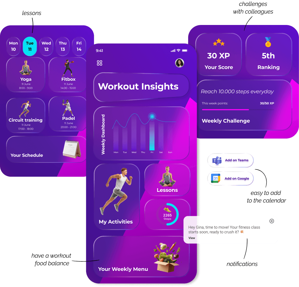
🤖 Adaptive Workout Engine
Dish Detail
Overview Lessons
🤖 Follow personal training plans
🤖 AI Onboarding food program
(for allergies and taste)
Connect your Apple watch
or smartwatch
🤖 Suggestions
Notifications after orders
Training Detail
Reserve a spot
Add to Calendar
Reminder
🤖 Feedback Dish
in the end of the day after 4 pm
🤖 AI Suggestions based on your training and notifications after your training
🤖 Cross-analyzes data between all dashboards → gives
balance suggestions.
🤖 Motivational Insights
notifications
05. Testing & Iteration
To validate the solution, I conducted usability sessions with 5 users, focusing on two main tasks:
Contact Sharing and Food Ordering.
06. Visual System
The interface is built on a modular visual system combining vibrant gradients, rounded components, and flexible UI cards designed for quick interaction.
Users wanted quicker access to food ordering from the dashboard.
Navigation needed clearer grouping of services and activities.
Personalisation options were important for dietary preferences.
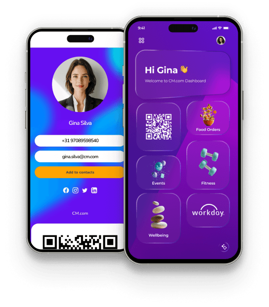
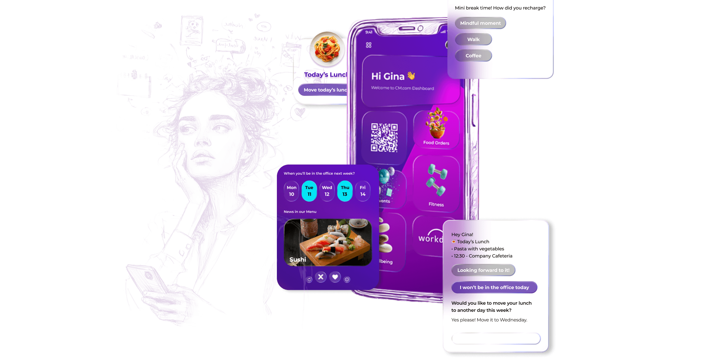
Hi Gina
Welcome to CM.com Dashboard

Food Orders
Fitness Program
Events in CM
Wellbeing
Workdays


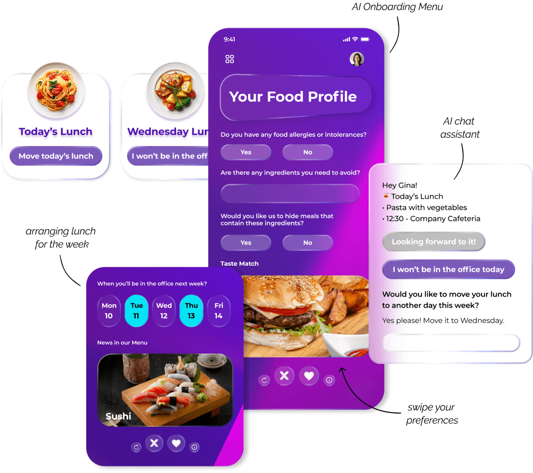
Your Food Profile
Are there any ingredients you need to avoid?

Do you have any food allergies or intolerances?
Yes
Would you like us to hide meals that
contain these ingredients?
Taste Match
No
Yes
No


From Business Card to a Daily Hub - Final UI
The final interface combines networking, food services, and wellness activities into a unified mobile experience designed for simplicity and engagement.
Before
After
🍝 Smart Lunch Picks
AI-powered meal suggestions based on personal preferences, allergies, and office days.


Relax & Recharge
Added “Relax and Recharge” Label
Users didn’t grasp the purpose of the rotating images,
so a clear label improved clarity.
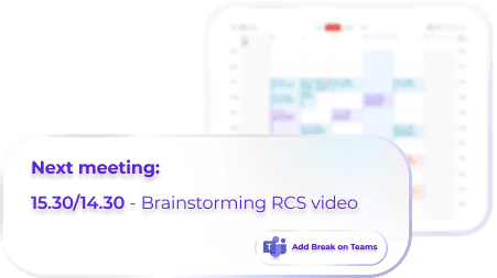
Calendar Redesign – Focus on the Next Meeting
Simplified the calendar to show just the upcoming meeting
with an “Add Break on Teams” button for clarity.
80%
Reported feeling more focused.
70%
Stated it boosted motivation.
90%
Found it "refreshing"
compared
to standard tools.
09. Accessibility & Inclusive Design
Contrast & Legibility: The color palette was tested to ensure a contrast ratio that meets WCAG 2.1 standards for accessibility.
Visual Hierarchy: Typography and spacing were optimized to provide a clear reading path for all users, including those with visual or cognitive impairments.
Touch Targets: Interactive elements are sized to be easily clickable, reducing errors and improving the experience for users with motor difficulties.
Key takeaways
Human-centred productivity
A small everyday tool, when redesigned around real employee needs, can meaningfully reduce stress, improve focus, and create healthier work habits.
Less overload,
more clarity
Simplifying information can empower employees to manage their day with ease and confidence.
A smarter way to support wellbeing at work
When design prioritizes wellbeing, even a simple business card can become a meaningful companion in the workday.
This concept explores how a digital business card can evolve into a workplace platform that connects networking, food services, and wellness activities into one unified experience.
Before designing the interface, I mapped the primary user journey to identify friction points and guide design decisions that reduce drop-off.
The interface was refined to balance clarity and personalization.
A modular layout helps reduce cognitive load while keeping the experience engaging and easy to navigate.
🏋️ Fitness Experience
Adaptive workouts suggested by AI, tailored to energy levels and available time.
💖 Mindful Breaks
AI detects stress patterns and suggests mindful breaks at the right moment.
*Personalised suggestions simplify daily lunch planning.
Research Questions
Research Insights
Gina Silva

Age
40
Occupation
Developer
Location
Breda
Emotional State
Frustrated, impatient, overwhelmed.
Profile
Internal employee working mainly with internal teams
and tools.
Goals
•
Manage daily office activities efficiently
•
Quickly access food options and company services
•
Maintain a balanced routine during busy workdays
Frustrations
•
Switching between multiple apps to manage tasks
•
Losing time with fragmented information
•
Lack of integration between services
Needs
•
A single platform that connects office services
•
Quick access to lunch menus and wellness activities
•
Simple interactions during busy schedules
Order Food
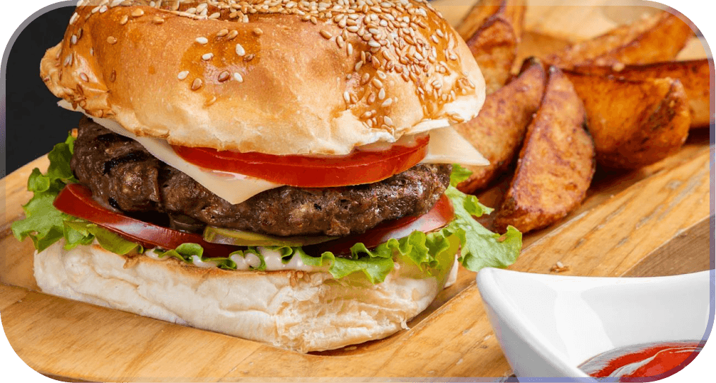
Employees can quickly browse the daily menu and schedule meals directly from the app.
Fitness Program
Users can explore available activities and join wellness sessions organized by the company.
Design Principles:
Primary color
Purple 100
Accent color
Cyan
Text color
White
Background color
Gradient Purple
Typography:
Montserrat
Main Title
Bold
32–40 px
Section Title
SemiBold
22–24 px
Body / Instructions
Regular
16–18 px
UI Labels / Buttons
Bold
14–16 px
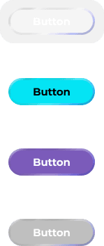
UI Components:
Button Variants
Pills
Cards


Relax & Recharge

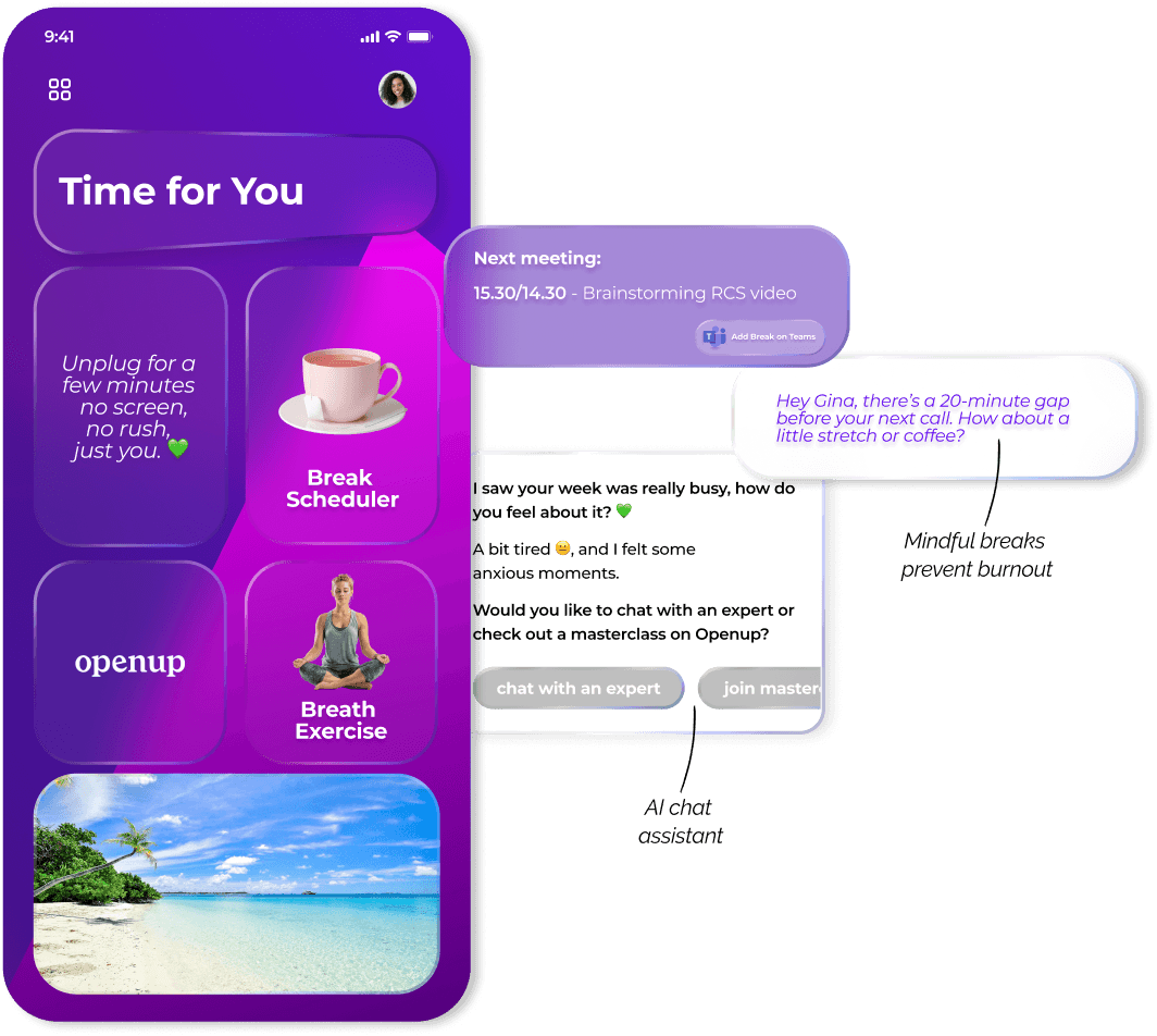
*Content is prioritised to encourage quick, restorative moments.
*Progress-focused design encourages consistent engagement.