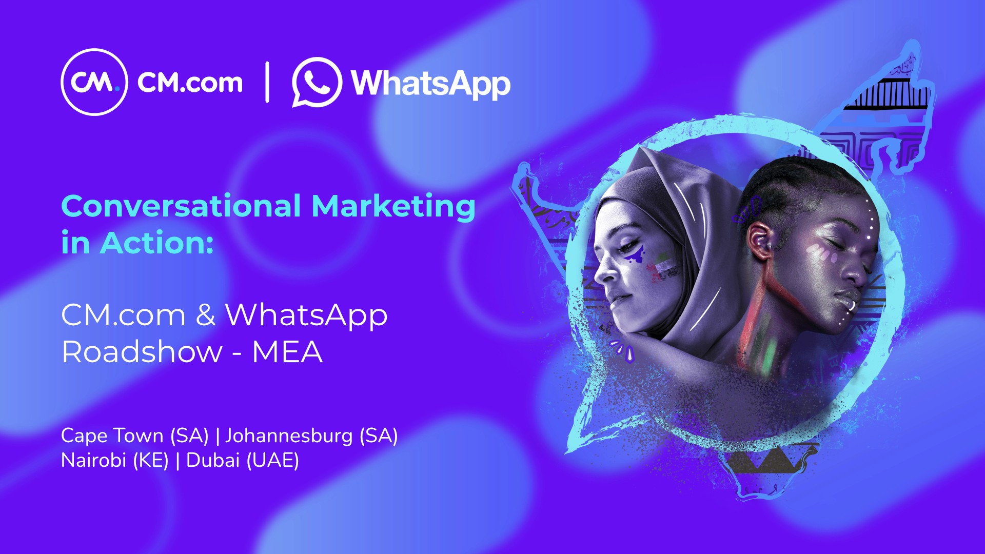
Designing a Scalable Multi-Regional Identity System
for the WhatsApp Meta Roadshow
A modular visual identity system bridging cultural diversity across the Middle East, Africa, and APAC.


01. Overview
Problem
The Meta WhatsApp Roadshow required a cohesive visual identity capable of unifying distinct cultural regions while maintaining global brand consistency.
Goal
Create a scalable identity system adaptable across multiple regions without losing local relevance or
emotional resonance.
My Role
Concept & design lead - responsible for visual system architecture, cultural research integration,
and cross-regional asset adaptation.
02. Research & Cultural Insights
I analysed visual languages, cultural symbols, and typographic traditions across South Africa and the UAE to identify meaningful patterns that could coexist within a unified system.
Key insight:
Cultural identity is deeply symbolic and must be respected, not diluted.
A rigid global identity would reduce emotional connection.
A flexible framework would allow local nuance within global coherence.
The solution required balancing:
Structure vs. flexibility
Global consistency vs. local expression
Brand clarity vs. cultural empathy
Geometric structural grids
Adaptable cultural pattern layers
Controlled colour palettes
Consistent typographic hierarchy
Target Audience
Business Leaders
Improve customer journeys & reduce drop-off.
Marketing & CRM Teams
Adopt conversational marketing & automation.
Developers & Integrators
Implement WhatsApp APIs
& chatbot flows.
Regional Teams
(Africa, ME, APAC)
Localize communication &
digital experiences.
How can two distinct cultures be combined
into one unified identity?
04. System Architecture
A modular framework designed for global consistency and regional adaptability.
Primary Color Logic
A controlled color system balancing global consistency and regional adaptability.

Core Structural Frame
Cultural Layer Boundary
Focal Zone


Defines the flexible perimeter where regional patterns and cultural elements can adapt without altering the core structure.

Stacked architecture
Typography Hierarchy
A structured typographic system ensures clarity across multilingual and multi-format environments.
Primary Typeface: Montserrat
Selected for its rounded geometry and approachable tone.
Body/Text: Nunito
Selected for its rounded geometry and approachable tone.
The color system is structured around a strong brand purple foundation, supported by blue and cyan accents that reinforce energy, contrast, and visual hierarchy across event materials.
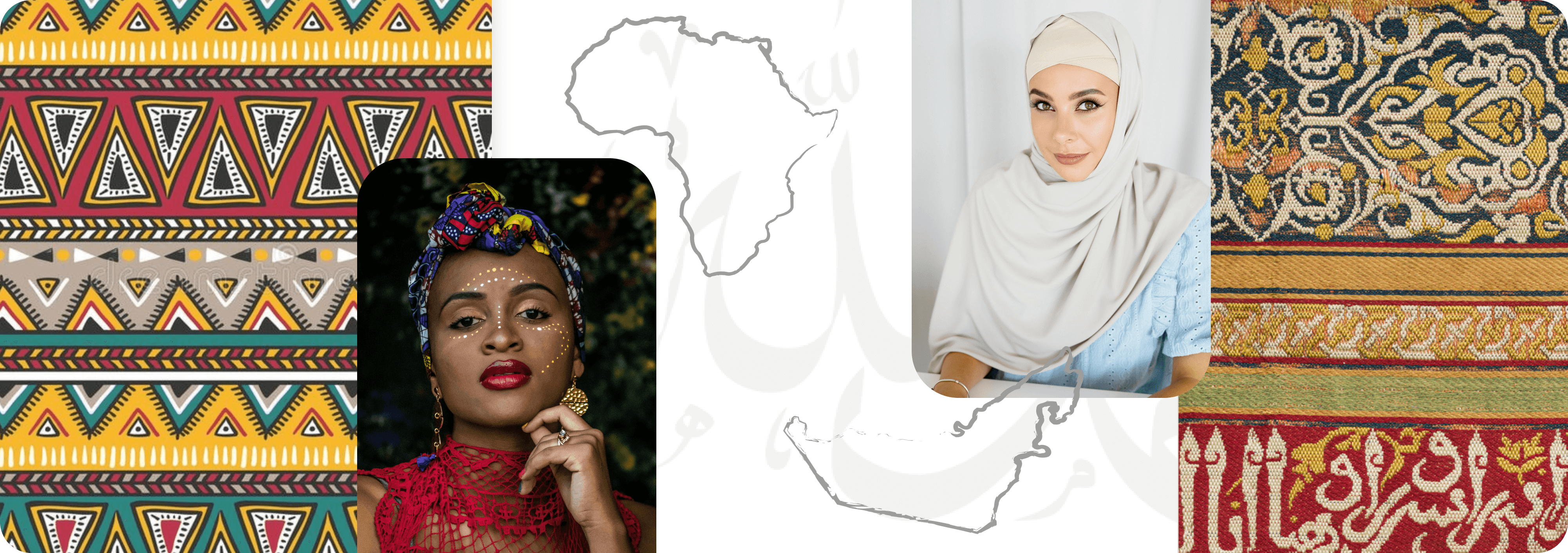
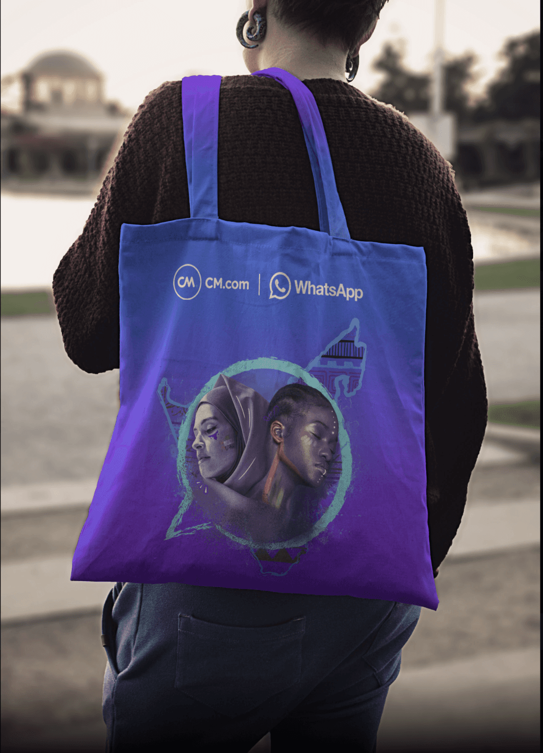
05. Identity Variations & Scalability
The identity system was designed to remain structurally consistent while adapting to different regional contexts.
Each variation preserves the core visual framework while introducing culturally relevant imagery.

South Africa Version
Incorporates African textile patterns and color motifs to reflect local visual culture.

UAE Version
Combines Arabic calligraphy and geometric ornaments within the shared circular identity.

China Version
Adapts the cultural layer with local symbolic patterns while maintaining the core visual structure.
07. Impact on Brand Adoption
The visual system successfully scaled across multiple regions while maintaining a unified brand experience.
98%
system compliance across all regions
+40%
adoption of identity templates by local teams
3 regions
activated without redesigns
08. Key Learnings
The visual system successfully scaled across multiple regions while maintaining a unified brand experience.
Designing for cultural diversity requires balancing consistency and local expression.
Modular systems allow identities to scale across regions without redesign.
A strong structural framework enables creative flexibility.
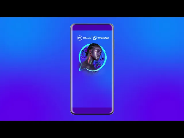
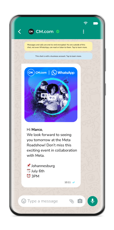
Stage Visual


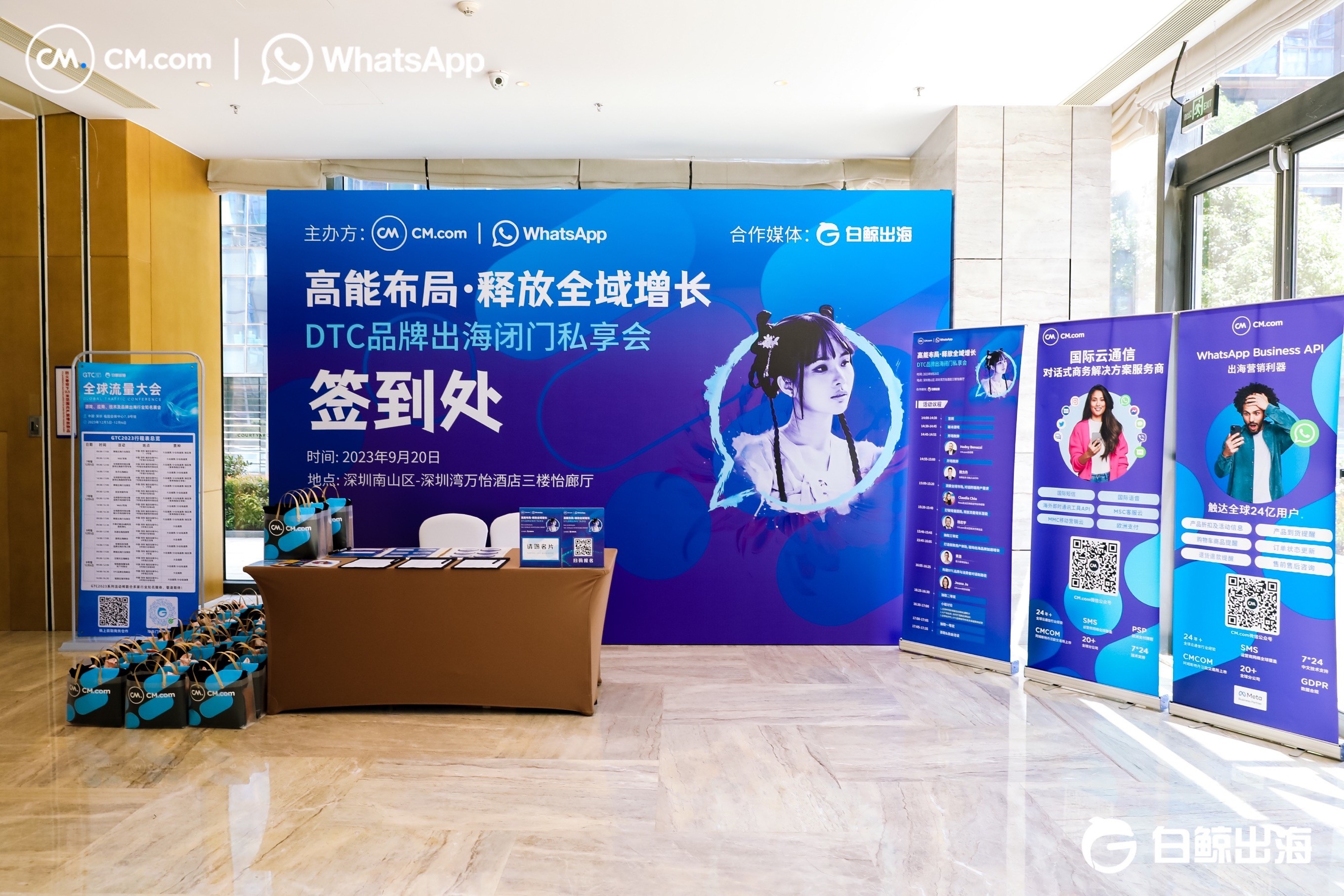
06. System in Context
The modular identity was applied across multiple formats, from event stages and digital screens
to printed materials and merchandise.
This project demonstrates how a modular identity system can balance global consistency with cultural adaptability across diverse audiences.
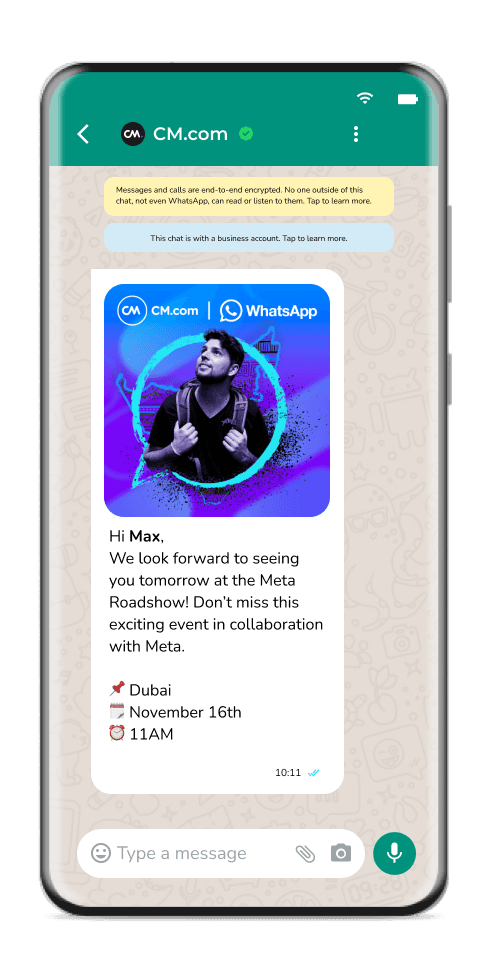
Digital Assets
Core Brand Purple
Accent Blue
Accent Cyan
Primary Color
Design Token
primary-100
accent-100
accent-200
Hex Code
#5D11DC
#007FFF
#04E4F4
Primary Title (H1)
WhatsApp Meta Roadshow
Used for stage headers, hero banners,
and key event messaging.
Secondary Title (H2)
Bridging Technology & Cultural Empathy
Supports narrative framing
across regions.
Body/Supporting Text
A visual identity system designed to connect diverse
cultural audiences under a unified global experience.
Optimised for readability across
print and digital formats.
03. Challenge Framing